DZCO LLC
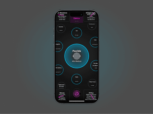
DZCO is a music discovery platform that replaces linear menus with a spatial, mood-driven interface. Instead of scrolling lists, users explore clusters of songs organized around genre, vibe, and context: encouraging curiosity, wandering, and serendipitous listening among users.
Under the guidance of Stephen Zoepf, former proffessor at Stanford and MIT Alum, I led product design and qualitative research, via moderated user testing to understand why new users were dropping off shortly after onboarding and how the interface could better support clarity, control, and exploration.
CEO
Stephen Zoepf
Team
Parker Monroe, B. Cheng
Role
Product Designer
Year
Mar 2024 - Aug 2025

PROJECT OVERVIEW
Problem Statement
Early testers engaged inconsistently with key features, and the team couldn’t explain why.
My Role
Parker and I led qualitative research and synthesis, translating findings into clear design priorities for the next iterations.
STRATEGY
Given limited engineering bandwidth, we optimized for clarity, not complexity.
DZCO initially engaged us for a short-term user research contract focused on usability testing, synthesis, and problem redefinition. Following our initial collaboration, DZCO expanded the engagement into a part-time partnership to support ongoing product development. Across multiple sprints, our work extended beyond core product research to include discovery efforts that informed investor pitches, as well as critical design mocks used directly in DZCO’s patent application. This hybrid approach allowed us to balance near-term product clarity with long-term business and IP strategy.
1
User Interviews
Identify early breakdowns in orientation, confidence, and control during first-time exploration.
2
Discovery & Research
Explore how users interpret spatial metaphors, navigational cues, and value beyond existing music platforms.
3
Insight-Driven Iteration
Translate qualitative feedback & research into system-level refinements across navigation, typography, and interaction.
4
Discovery & Research
Evaluate new mocks through testing & identify what’s working, what’s causing friction, and where further refinement is needed.
RESEARCH
Together with Parker Monroe, I conducted qualitative research across 46 sessions, including moderated interviews and open-ended usability walk-throughs. I personally led 22 sessions, while Parker conducted 24, allowing us to compare patterns emerging through notes and validate findings across facilitators. Our interviews were crafted to understand how first-time users interpreted the song map, navigated the interface, and evaluated DZCO’s value compared to existing music platforms.
I synthesized findings across sessions and identified three recurring breakdowns that consistently limited early engagement:
visual overload during initial exploration
unclear hierarchy and difficulty interpreting navigational cues
unmet expectations around social or shared discovery

This is compelling but music discovery alone isn’t enough to keep me here. Since I already use Spotify, I’d want something more like a social or interactive aspect that gives me a reason to stay longer.
CJ Heineke, 35
I know the tags in the corners are meant to guide me through the music map, but it’s not clear how to interpret them at first. I get lost easily because there are so many competing elements.
Steve Ossim, 34
There’s a lot happening on the screen at once. The song labels in the background are hard to read, and it makes it difficult to know where to focus. I’d feel more comfortable if the interface were visually simpler.
Aliya Ali, 31
The excerpts above illustrate how these issues surfaced in participants’ own words.
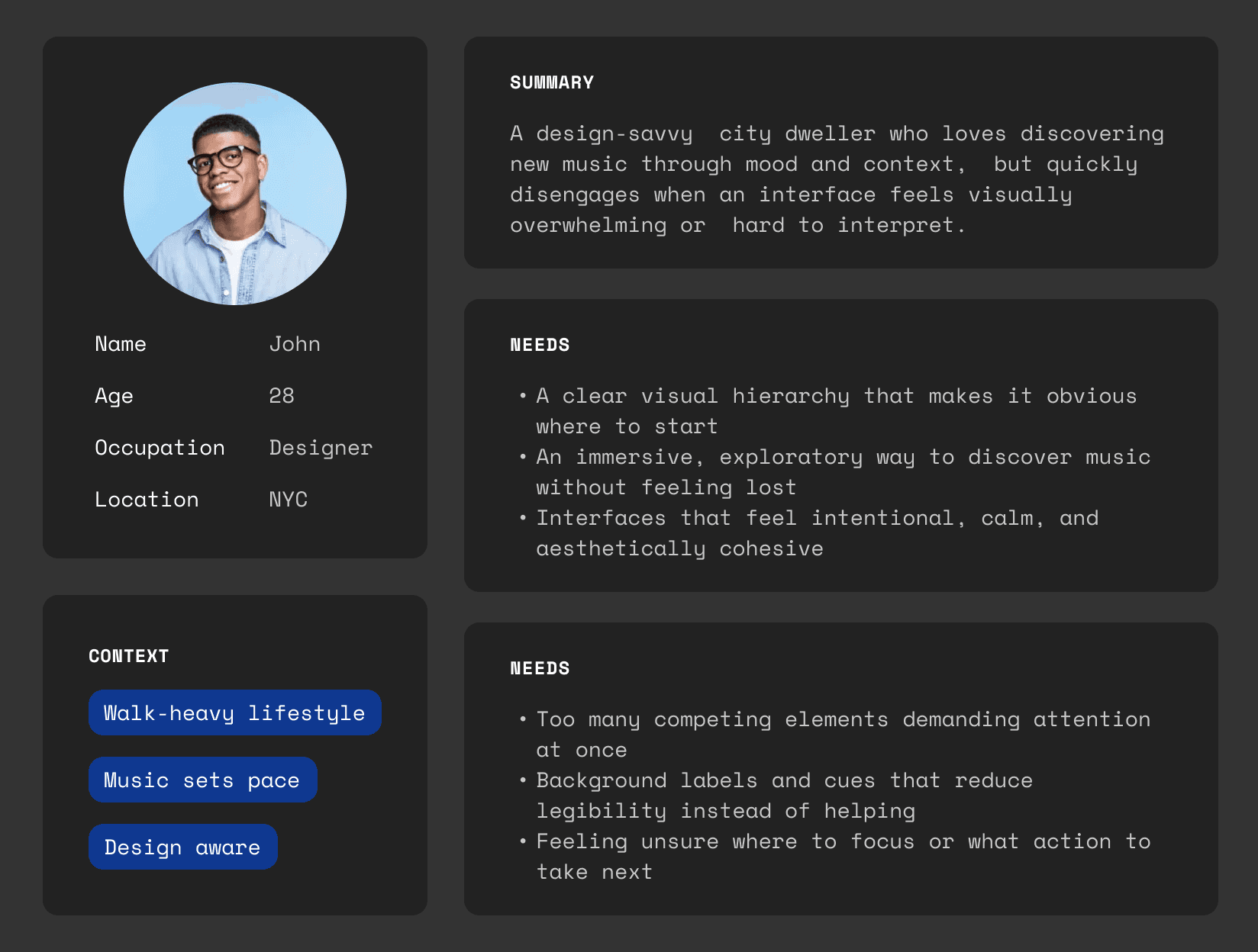
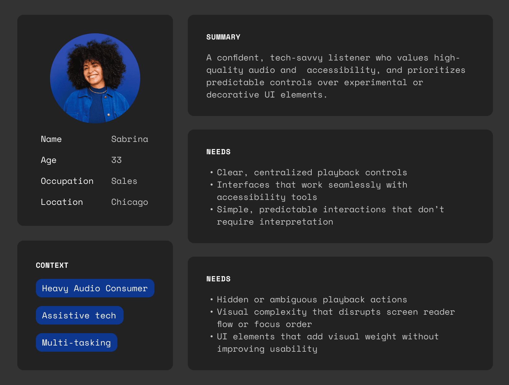
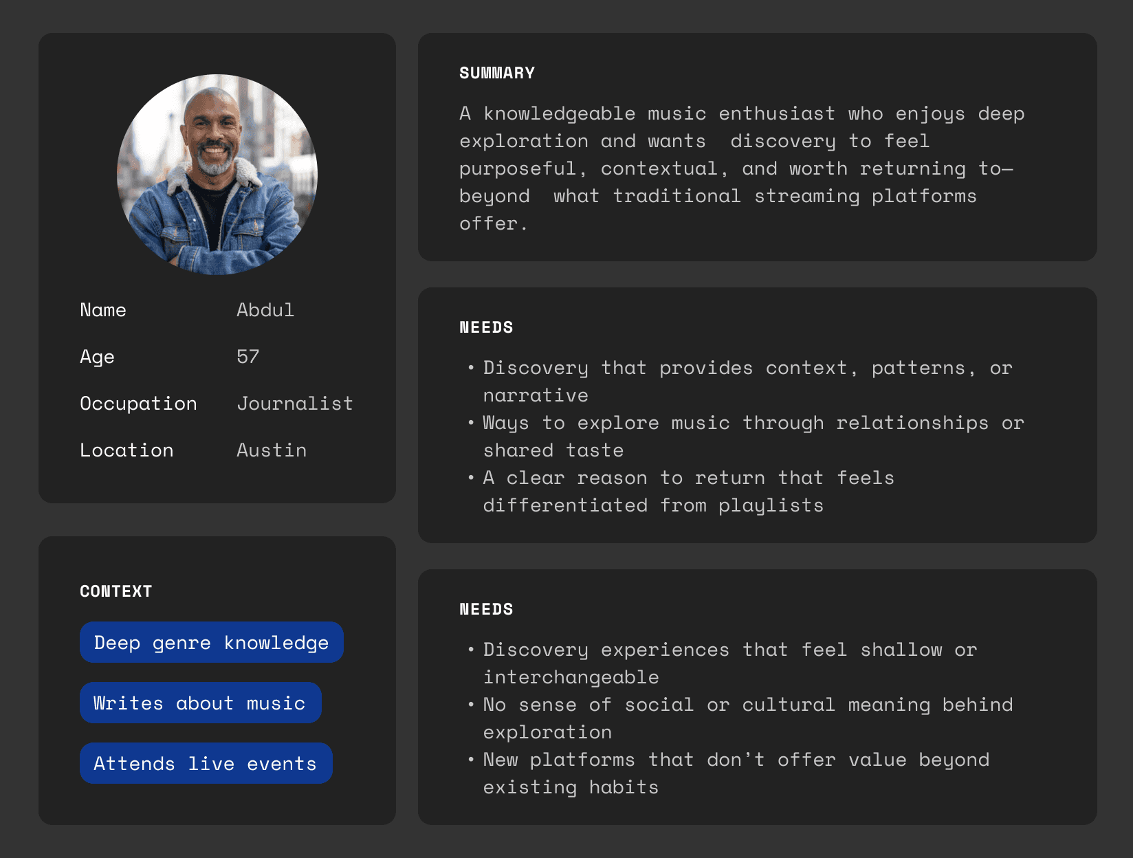
PERSONAS
I synthesized findings from qualitative research into three behavioral archetypes that represented the most consistent patterns observed during testing. We primarily designed for the Urban Explorer, as this group faced the greatest friction during first-time use and on-boarding. The remaining personas informed secondary needs and longer-term engagement.
I also tested with users who rely on visual accessibility tools and audio assistive technologies, reinforcing the importance of clear hierarchy, predictable controls, and reduced visual complexity across all user types.
DISCOVERY
We mapped key moments of engagement and friction across the first-time DZCO experience to understand where users lost orientation, control, or confidence. While early exploration felt playful and intriguing, the journey revealed a sharp drop-off once users attempted to navigate intentionally or retrace their steps.
A clear pattern emerged:
Initial curiosity was driven by the novelty of the song map and gestural exploration
Engagement declined when users tried to understand where they were or how to get back
Visual density and competing cues made it difficult to identify a clear next action
Social and shared discovery expectations were unmet, reducing long-term motivation

This shift—from delight to disorientation—helped explain why users disengaged before discovering DZCO’s deeper value.
The core issue wasn’t missing features.
It was cognitive overload preventing users from understanding what already existed.
These insights directly informed our strategy to prioritize visual hierarchy, navigational clarity, and reduced on-screen competition before introducing new functionality.
RESEARCH SUMMARY
Early user engagement broke down not because of missing features, but because users struggled to orient themselves once exploration became intentional.
The Problem
DZCO’s spatial music map captured curiosity, but failed to sustain clarity for first-time users. As exploration progressed, competing visual elements obscured hierarchy, leaving users unsure where to focus or how to proceed—especially during onboarding.
What Research Revealed
Research showed that users relied on predictable playback controls to orient themselves, while secondary cues like arrows and background labels were frequently overlooked or misunderstood. Rather than aiding navigation, these elements increased cognitive load and accelerated early disorientation.
Design Implication
Based on these findings, Parker and I deliberately reduced visual complexity to lower early cognitive load and make primary actions immediately legible. We streamlined the existing style system, shifted toward a more neutral palette to avoid unintended brand associations, and simplified navigation patterns to prioritize clarity and ease of use during first-time exploration.
SOLUTIONS
Design hypothesis
Early disorientation stemmed less from the spatial map itself and more from insufficient visual hierarchy — making it unclear what was interactive, primary, or safe to ignore during first-time exploration.
What we changed
To address this, I revised DZCO’s style guide with a focus on hierarchy, legibility, and cognitive load reduction. Research showed users struggled to identify where to focus first and which elements were actionable, particularly during initial exploration.
We introduced stricter type scale and color rules to clarify priority states. Active elements were elevated through size and weight, while secondary content was intentionally de-emphasized through sizing while still remaining legible. The color palette was simplified to reduce visual competition and ensure emphasis was driven by interaction state rather than decoration.
Outcome
These changes preserved DZCO’s spatial, exploratory feel while making the interface easier to scan, interpret, and recover within — especially for first-time users.
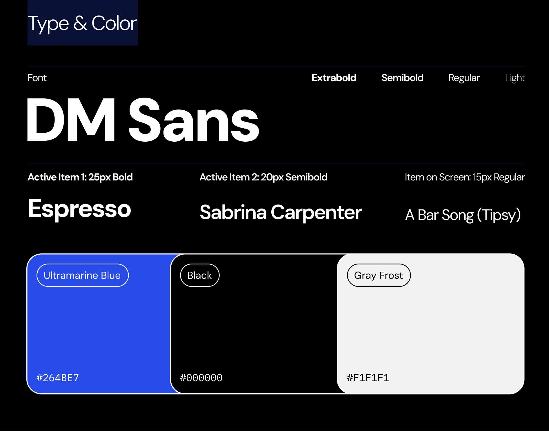
Applying clearer hierarchy and interaction states reduced visual competition, helping users immediately recognize where to focus, what was actionable, and how to move confidently through the map.


REFLECTIONS
This project deepened my understanding of how fragile first-time experiences can be. While DZCO’s spatial map invited curiosity, research showed that clarity and recoverability mattered more than novelty in early moments. This project reinforced that novelty earns attention, but clarity earns trust: especially in first-time experiences.
In future iterations, I’d like to validate these changes through longer-term retention metrics and explore how social discovery scales once orientation is no longer a barrier. Given more time, I would validate these changes through longer-term testing and explore how social discovery could emerge further once users felt oriented and confident within the map.